WebApp Redesign
USER EXPERIENCE
INTERFACE DESIGN
Figma | Wordpress with Elementor | Adobe Illustrator | Adobe Photoshop

BACKGROUND
MoMeBox
MoMeBox is an online retail platform dedicated to providing a curated selection of gifts tailored for expectant mothers. The application offers the flexibility of individual gift purchases or the convenience of a subscription plan, allowing users to receive trimester-specific gift packs.

THE PROBLEM
Low conversion rates
MoMeBox encountered a pressing issue with low conversion rates, posing a threat to the business's viability. The struggle to translate visitor engagement into tangible sales posed a significant risk. Conversion rates before my UX enhancements were as low as 4%.
RESEARCH
User Exit Points: Where Users Left and Why
I used Google Analytics funnel and user interviews to understand at which point users were leaving the website.
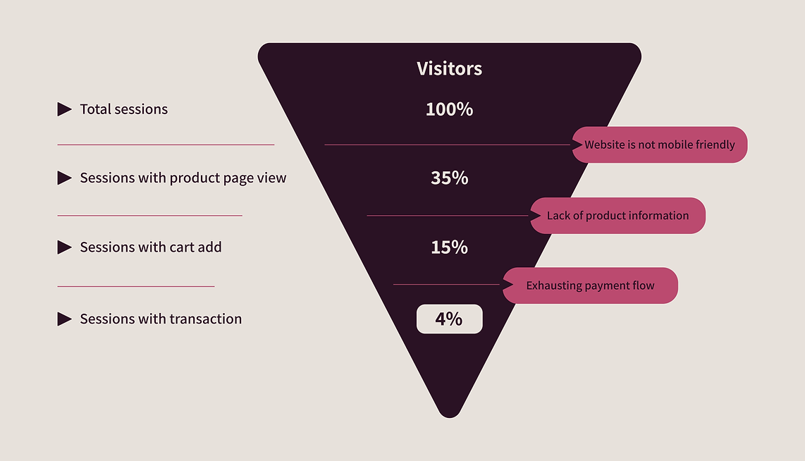
While mobile friendliness and product information were relatively straightforward to assess, identifying issues with the checkout process proved to be more challenging.
Checkout Process Issues
Through the analysis, it became evident that the checkout process posed significant complexity, as indicated by the feedback from interviewees (Iinterviewed 7 users), who mentioned the following reasons:

Users expressed frustration with the requirement to create an account while trying to pay, finding it inconvenient and a barrier to completing their purchase smoothly.

Users noted dissatisfaction due to limited payment options, feeling constrained and preferring more flexibility in choosing their preferred payment method.
SOLUTION
Enhanced Product Pages Boost Engagement
Revamping product pages, I introduced comprehensive details to address user feedback. By enriching content with thorough descriptions, and high-quality images, the new pages offer a more immersive shopping experience

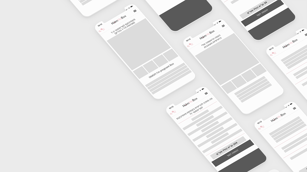
Optimized Screen Compatibility
I restructured the website's layout to ensure seamless navigation across various screen sizes. Implementing responsive design principles, the website now adapts effortlessly to different devices, enhancing user accessibility and satisfaction.


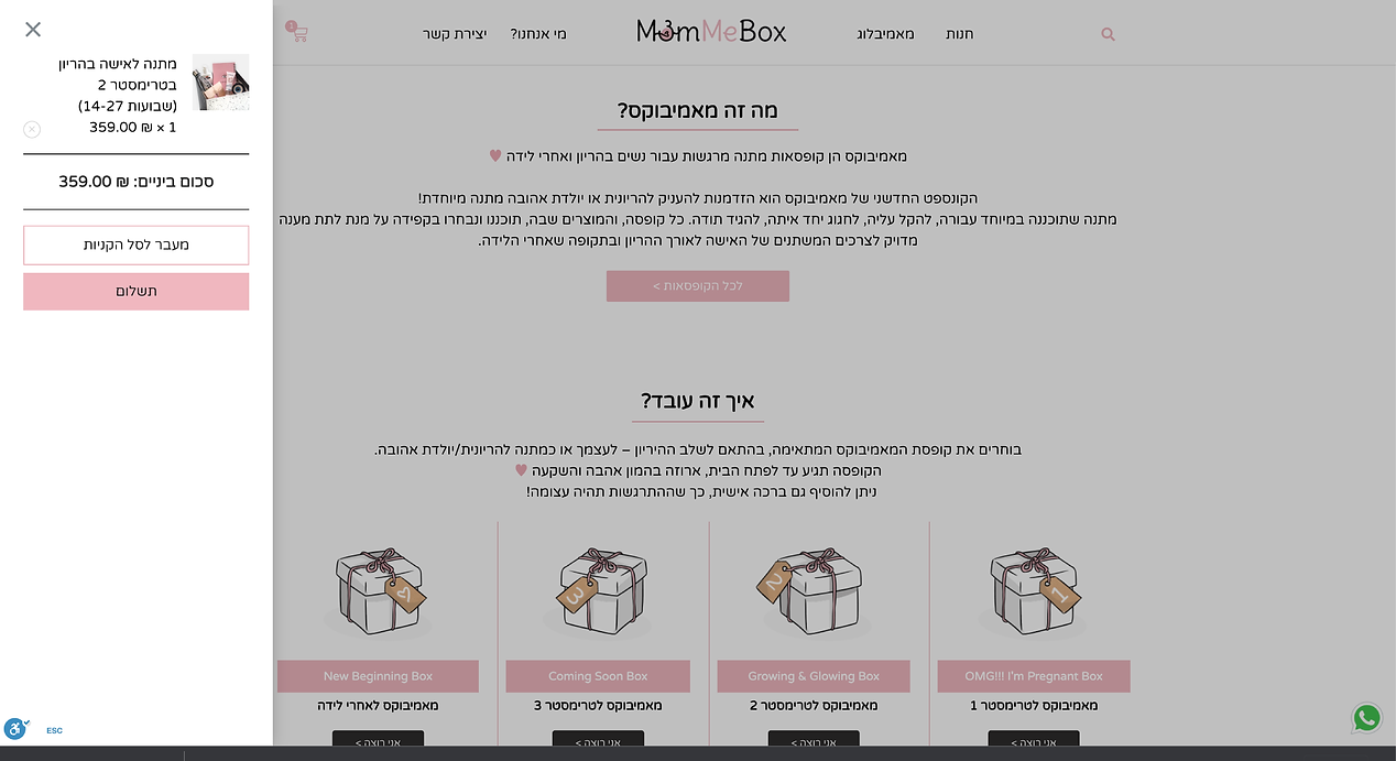
Streamlined Checkout Enhancements
To streamline the checkout process, I eliminated user subscription requirements, resulting in a shorter and more efficient journey for customers. Additionally, I integrated multiple quick payment options to offer users greater flexibility and convenience during their transactions.

DESIGN